Context
Klarna offers lines of credit to customers at point of sale. But they can't lend to everyone.
They need to lend responsibly, by managing risk to themselves and their customers.
To do this, they use risk-analysis systems that determine who is eligible for credit at the point of sale. Users who aren't eligible get a rejection message.
Problem
Users are denied credit for many reasons, ranging from poor credit history to mismatched personal data.
To manage this complexity, this BNLP provider bundled rejection reasons into a small set of general front-end messages.
These messages needed to be general to account for a wide range of cases. This meant that the messages couldnt't give users the context to understand why they were rejected, leaving them feeling confused, frustrated, and embarrassed.
In some cases, users could potentially take actions that would change the outcome of a lending decision.
By not giving users that opportunity, they were leaving money on the table.

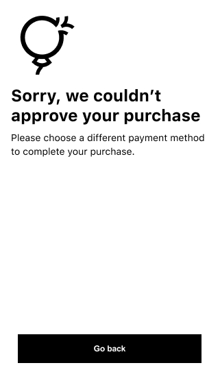
Example of a rejection. As you can see, it doesn't tell you much.
Solution
Together with the credit analysts and engineers on my team, I created a map of all rejection reasons matched up to their frontend responses
For any rejection reasons that we could safely and responsibly make more specific, I created a new message that we then re-mapped in the backend.
In some cases, this meant developing new features or surfacing new datapoints in the front-end.
And since we were looking at everything anyway, I took the opportunity to update our existing messages in accordance with modern UX Writing standards.
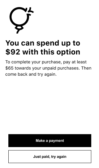
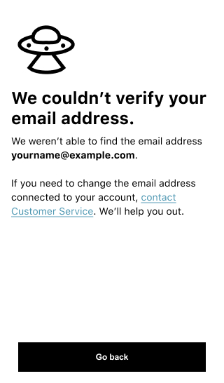
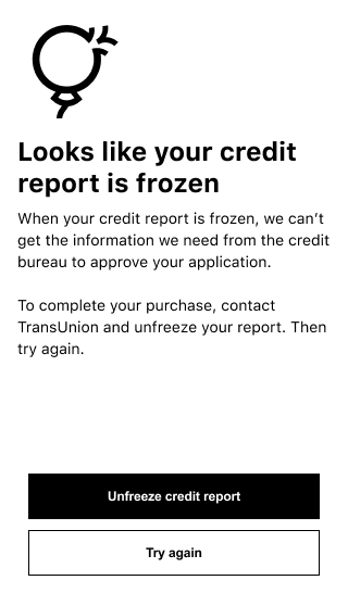
A few example improvements
Results
-
Improved checkout conversion
-
Better overall UX at the point of rejection
-
Reduced customer errands around rejections
-
Improvements to adjascent product metrics, like paid overdue debts


